Trend and forecast
A Line chart over dates (or plain numbers) can draw a trend over each line and forecast it ahead. The controls sit in the row above the plot and only appear for Line charts.
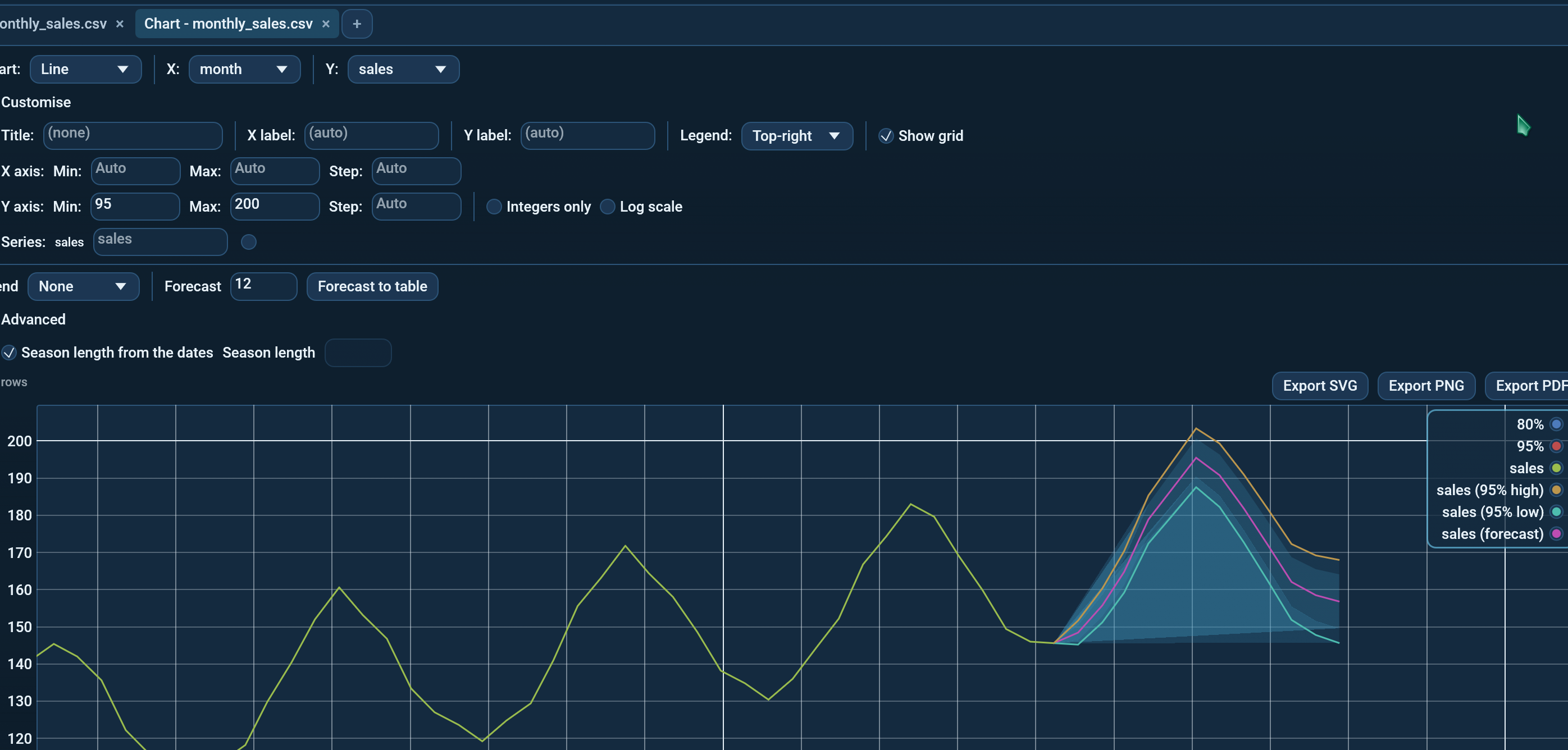
Trend
| Trend | What it draws |
|---|---|
| None | Nothing. |
| Straight line | The straight line that fits the points best (least squares). |
| Moving average | At each point, the average of the last few: one season when the dates show one (7 for daily, 12 for monthly data), else 5 points. |
The trend is drawn as an extra series named <series> (trend).
Forecast
Type how many periods to forecast into Forecast; 0 turns it off. Each line
gets a continuation, <series> (forecast), starting from its last real point,
with two shaded ranges around it:
- the darker band is the 80% range: the value is expected to land inside it four times out of five;
- the lighter band is the 95% range.
Both widen the further ahead the forecast goes. The model is Holt-Winters: it follows the level, the trend and a repeating season, and picks its own smoothing from the history. There is nothing to tune.
Seasons
The season is read from the spacing of the dates:
| Spacing | Season length |
|---|---|
| Hourly | 24 |
| Daily | 7 |
| Weekly | 52 |
| Monthly | 12 |
| Quarterly | 4 |
| Yearly | none |
A season is only used with at least two full cycles of history; with less, the forecast follows the level and trend alone. Monthly, quarterly and yearly forecasts step by calendar months, so they land on the same day of the month as the data. Under Advanced, untick Season length from the dates to set the length yourself.
Evenly spaced points
A forecast needs at least 4 points, evenly spaced. Transactions with gaps between them are not a series yet: bucket them first with Analyse -> Time series (say, a sum per month), chart that, then forecast. The chart says so when the spacing is uneven.
Forecast to table
Forecast to table opens the forecast of each line in a new tab: one row
per period with x, forecast, lo80, hi80, lo95 and hi95, ready to
save or copy.
Exports
PNG, SVG and PDF exports include the trend and forecast lines. The shaded
bands are on-screen only; exports draw the 95% range as two lines,
(95% low) and (95% high). On a log-scaled Y axis the bands are left out
too, since a range can dip below zero.
Try it
samples/features/monthly_sales.csv has four years of monthly sales with a
summer peak. Open it, choose Analyse -> Chart..., pick Line with month
as X and sales as Y, and set Forecast to 12.
Command line and MCP
octa --forecast (see --forecast) and the
forecast MCP tool use the same model.