Chart
Render the active table as an interactive chart. Charts open as their own tabs so you can keep the source table open side-by-side and have several charts of the same data running at once.
Trigger via:
- Analyse → Chart... in the toolbar
- F5
The entry is hidden on string-only tables since there's nothing to plot.
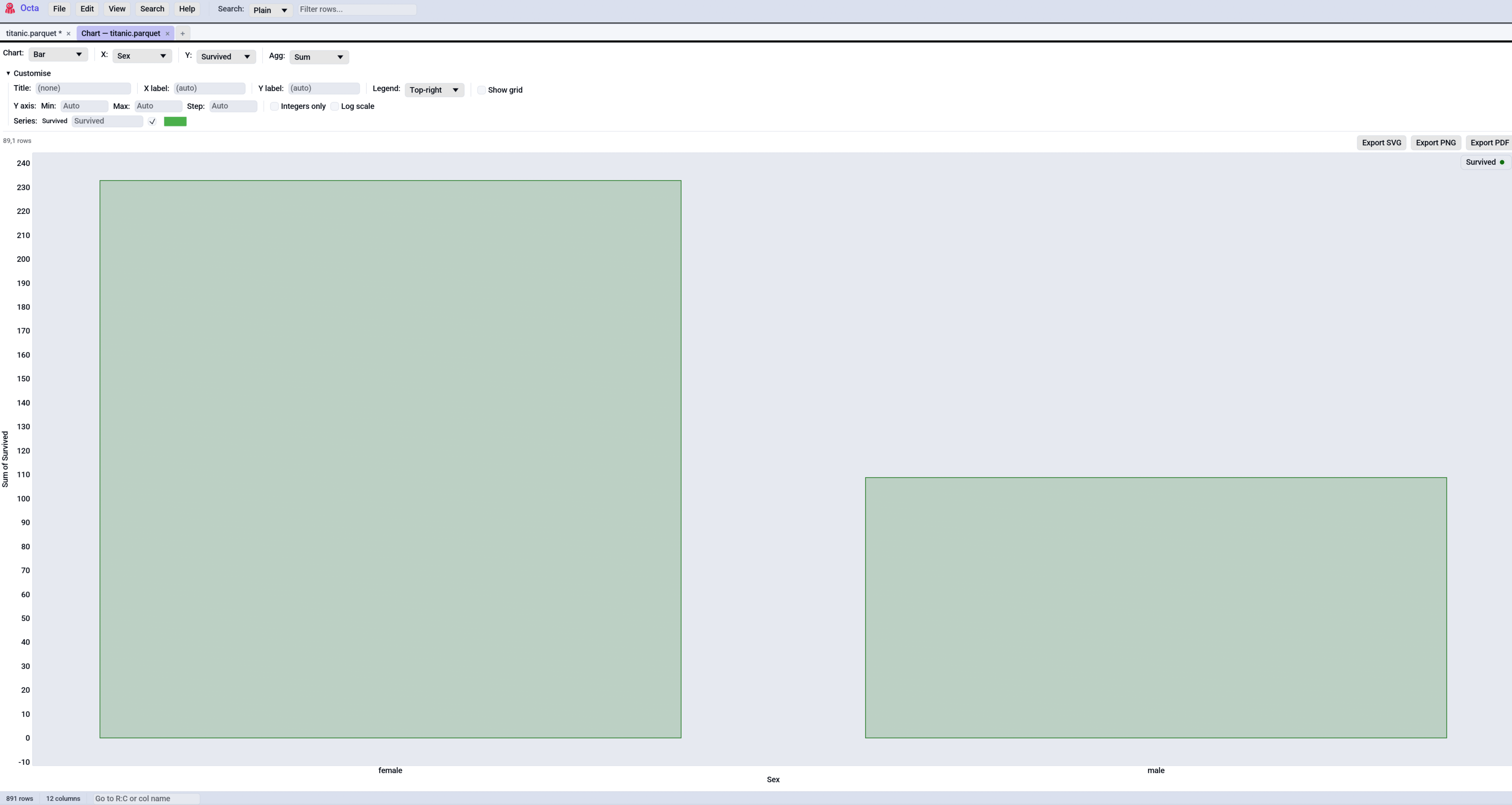
Chart kinds
Pick the chart kind in the leftmost combo of the control bar. Each kind expects a specific column shape:
| Kind | X column | Y column(s) | Notes |
|---|---|---|---|
| Histogram | Numeric / Date / DateTime | (none) | Frequency count of X values, binned via Sturges' rule. |
| Bar | Categorical (or numeric) | One or more numeric | Groups rows by X, aggregates Y(s) via the chosen aggregation. |
| Line | Numeric / Date / DateTime | One or more numeric | One polyline per Y column. Points auto-sort by X. |
| Scatter | Numeric / Date / DateTime | One or more numeric | Disconnected point cloud, one series per Y column. |
| Box | (none) | One or more numeric | Tukey 5-number summary per Y column. |
Dates on the axes
Date columns are internally charted as days since 1970-01-01 and
DateTime columns as seconds since the Unix epoch, but the X-axis
tick labels are formatted back into dates (YYYY-MM-DD for
Date, YYYY-MM-DD HH:MM:SS for DateTime). So a histogram of a
date column shows 2024-01-01 / 2024-01-15 / 2024-02-01 on the X
axis rather than the raw 19723 / 19737 / 19754 values. The
same formatting applies to Line, Scatter, and the exported PNG /
SVG / PDF.
Supported parse formats: ISO YYYY-MM-DD, dotted European
DD.MM.YYYY, slashed European DD/MM/YYYY, slashed US MM/DD/YYYY.
For timestamps add the time component (YYYY-MM-DD HH:MM:SS, ISO T
separator, optional fractional seconds, optional trailing Z).
Categorical X axes
Bar charts (always) and Line / Scatter (when X is non-numeric)
treat the X column as categories. Each unique value gets one
tick labelled with the category name, in first-seen order. So a
bar of country → population shows DE / US / JP / ... on the X
axis, not 0 / 1 / 2 / .... Box plots use the Y column names as
their X-axis labels.
There's a configurable cap on distinct categories
(chart_max_categories,
default 250). Above it the chart refuses to draw and shows an
inline error asking you to filter or aggregate the table first.
For Line with categorical X, points sit at category indices in encounter order and the line connects them left-to-right. The result has the same shape as the Bar would draw, just stroked instead of filled.
Bar aggregations
| Aggregation | What it does |
|---|---|
| Sum | Add up every Y value in the group. |
| Avg | Arithmetic mean of every Y value in the group. |
| Count | Number of rows in the group (ignores Y values). |
| Min / Max | Smallest / largest Y value in the group. |
Histogram bins
Default: Sturges' rule (ceil(1 + log2(n)), clamped to [5, 50]).
Untick Auto (Sturges) to set the bin count by hand (1 to 250).
Customise
The Customise collapsible exposes presentation knobs:
- Title: free text rendered above the plot. Empty = no title.
- X-axis label: overrides the column name. Empty = use the column name.
- Y-axis label: same idea.
- Legend: Off / Top-left / Top-right / Bottom-left / Bottom-right.
- Grid: tick Show grid lines to render the background grid; untick for a clean white plot area.
- Series: per-Y-column Label override (used in legend + tooltip) and a custom Colour picker (tick Custom to override the auto-cycled palette colour).
X axis
A dedicated X axis sub-section under Customise, mirroring the Y axis controls so you can clamp either dimension:
| Control | What it does |
|---|---|
| Min / Max | Force fixed left / right bounds. Both must be set; a half-set range is ignored. Leave blank to auto-fit. For Date axes the bound is in days since 1970-01-01; for DateTime axes in seconds since the Unix epoch. |
| Step | Custom grid step in original-data units. Empty = let Octa pick. |
Categorical Bar and Box charts treat the bounds as category indices (0, 1, 2, …), so you can zoom into a slice of bars by setting Min / Max.
Y axis
A dedicated Y axis sub-section under Customise:
| Control | What it does |
|---|---|
| Min / Max | Force fixed lower / upper bounds. Both must be set; a half-set range is ignored. Click Auto to reset. |
| Step | Custom grid step in original-data units. Empty = let Octa pick. |
| Integers only | Format Y-axis ticks as whole numbers (no .0 suffix). Useful for counts. |
| Log scale | Apply log10(...) to the Y values before plotting. Non-positive values drop silently. The axis label gets a (log10) suffix and the tick formatter renders the original magnitudes (e.g. 100, 1000). |
When Min / Max are set with log scale on, the bounds are interpreted
in original-data units and projected into log10 space internally. Type
10 and 10000 to get the familiar three-decade range without doing
the maths.
Sampling
Histogram, Line, and Scatter are subject to
chart_max_points
(default 100,000). Above the cap the chart evenly-spaces samples
and a pill above the plot reads Sampled 100,000 of 5,000,000 rows.
Bar and Box always work off the full input. Bar can afford to because it aggregates per category anyway, and Box because the 5-number summary is cheap regardless of row count.
Even-spaced sampling will miss outliers. The right answer is to filter first and then chart, or to bump the cap if you have the memory.
Exporting
Three buttons sit on the right of the row above the plot:
| Button | What you get |
|---|---|
| Export PDF | One-page PDF rendered from the chart's SVG via svg2pdf. Print-quality vector. |
| Export PNG | 2x retina-resolution PNG (1600 x 1000 pixels) rendered by resvg from the same SVG. |
| Export SVG | The hand-emitted SVG file directly. Editable in Inkscape / Illustrator, embeddable in web pages. |
All three formats are derived from the same SVG so they look the same regardless of window size or DPI. Title / axis labels / legend / per-series colours carry into every export.
Interacting with the plot
| Gesture | Action |
|---|---|
| Drag | Pan. |
| Mouse wheel | Zoom in / out. |
| Right-drag a box | Zoom into that region. |
| Double-click | Reset to auto-bounds. |
| Hover over a point / bar | Show coordinates in a tooltip. |
See also
- Search & Filter for narrowing the table before charting.
- Value Frequency gives a
value_counts()-style view for a single column without leaving the table. - Settings → Performance is
where you configure
chart_max_pointsandchart_max_categories.